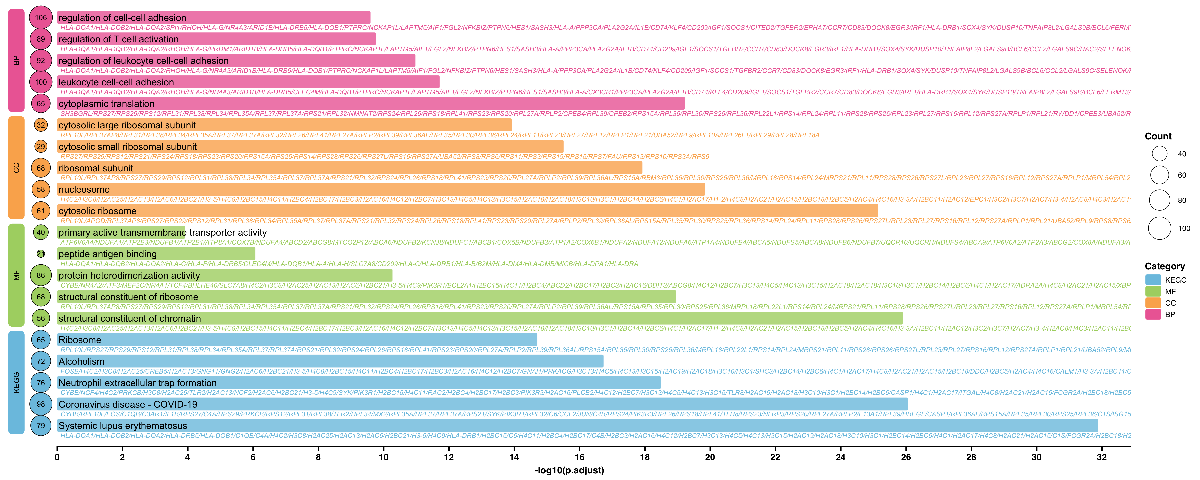
第 13 章 富集分析图
# 加载包
# devtools::install_github("dxsbiocc/gground")
library(gground)
library(ggprism)
library(tidyverse)
library(ggview)

# 加载数据
load("Rdata/ORA.RData")
GO <- go_up %>% as.data.frame()
KEGG <- kk_up %>% as.data.frame()
挑选想要展示的富集分析结果
# 举例:取 top5 。根据 FDR 值排序,相同 FDR 值取富集到基因最多的通路
use_pathway <- group_by(GO, ONTOLOGY) %>%
    top_n(5, wt = -p.adjust) %>%
    group_by(p.adjust) %>%
    top_n(1, wt = Count) %>%
    rbind(
        top_n(KEGG, 5, -p.adjust) %>%
            group_by(p.adjust) %>%
            top_n(1, wt = Count) %>%
            mutate(ONTOLOGY = 'KEGG')
    ) %>%
    ungroup() %>%
    mutate(ONTOLOGY = factor(ONTOLOGY,
                             levels = rev(c('BP', 'CC', 'MF', 'KEGG')))) %>%
    dplyr::arrange(ONTOLOGY, p.adjust) %>%
    mutate(Description = factor(Description, levels = Description)) %>%
    tibble::rowid_to_column('index')
构造左侧标记数据
# 左侧分类标签和基因数量点图的宽度
width <- 0.5
# x 轴长度
xaxis_max <- max(-log10(use_pathway$p.adjust)) + 1
# 左侧分类标签数据
rect.data <- group_by(use_pathway, ONTOLOGY) %>%
    reframe(n = n()) %>%
    ungroup() %>%
    mutate(
        xmin = -3 * width,
        xmax = -2 * width,
        ymax = cumsum(n),
        ymin = lag(ymax, default = 0) + 0.6,
        ymax = ymax + 0.4
    )
绘图
# pdf('pathway.pdf', width = 10, height = 8)
pal <- c('#7bc4e2', '#acd372', '#fbb05b', '#ed6ca4')
use_pathway %>%
    ggplot(aes(-log10(p.adjust), y = index, fill = ONTOLOGY)) +
    geom_round_col(
        aes(y = Description), width = 0.6, alpha = 0.8
    ) +
    geom_text(
        aes(x = 0.05, label = Description),
        hjust = 0, size = 5
    ) +
    geom_text(
        aes(x = 0.1, label = geneID, colour = ONTOLOGY),
        hjust = 0, vjust = 2.6, size = 3.5, fontface = 'italic',
        show.legend = FALSE
    ) +
    # 基因数量
    geom_point(
        aes(x = -width, size = Count),
        shape = 21
    ) +
    geom_text(
        aes(x = -width, label = Count)
    ) +
    scale_size_continuous(name = 'Count', range = c(5, 16)) +
    # 分类标签
    geom_round_rect(
        aes(xmin = xmin, xmax = xmax, ymin = ymin, ymax = ymax,
            fill = ONTOLOGY),
        data = rect.data,
        radius = unit(2, 'mm'),
        inherit.aes = FALSE
    ) +
    geom_text(
        aes(x = (xmin + xmax) / 2, y = (ymin + ymax) / 2, label = ONTOLOGY),
        data = rect.data,
        angle = 90,
        inherit.aes = FALSE
    ) +
    geom_segment(
        aes(x = 0, y = 0, xend = xaxis_max, yend = 0),
        linewidth = 1.5,
        inherit.aes = FALSE
    ) +
    labs(y = NULL) +
    scale_fill_manual(name = 'Category', values = pal) +
    scale_colour_manual(values = pal) +
    scale_x_continuous(
        breaks = seq(0, xaxis_max, 2),
        expand = expansion(c(0, 0))
    ) +
    theme_prism() +
    theme(
        axis.text.y = element_blank(),
        axis.line = element_blank(),
        axis.ticks.y = element_blank(),
        legend.title = element_text()
    )